Choosing Colours for Site Furniture
Colour changes how hot a seat gets, how fast a finish looks tired and how easily people find a bin or bollard. Here is how to choose finishes that still look right in ten years.
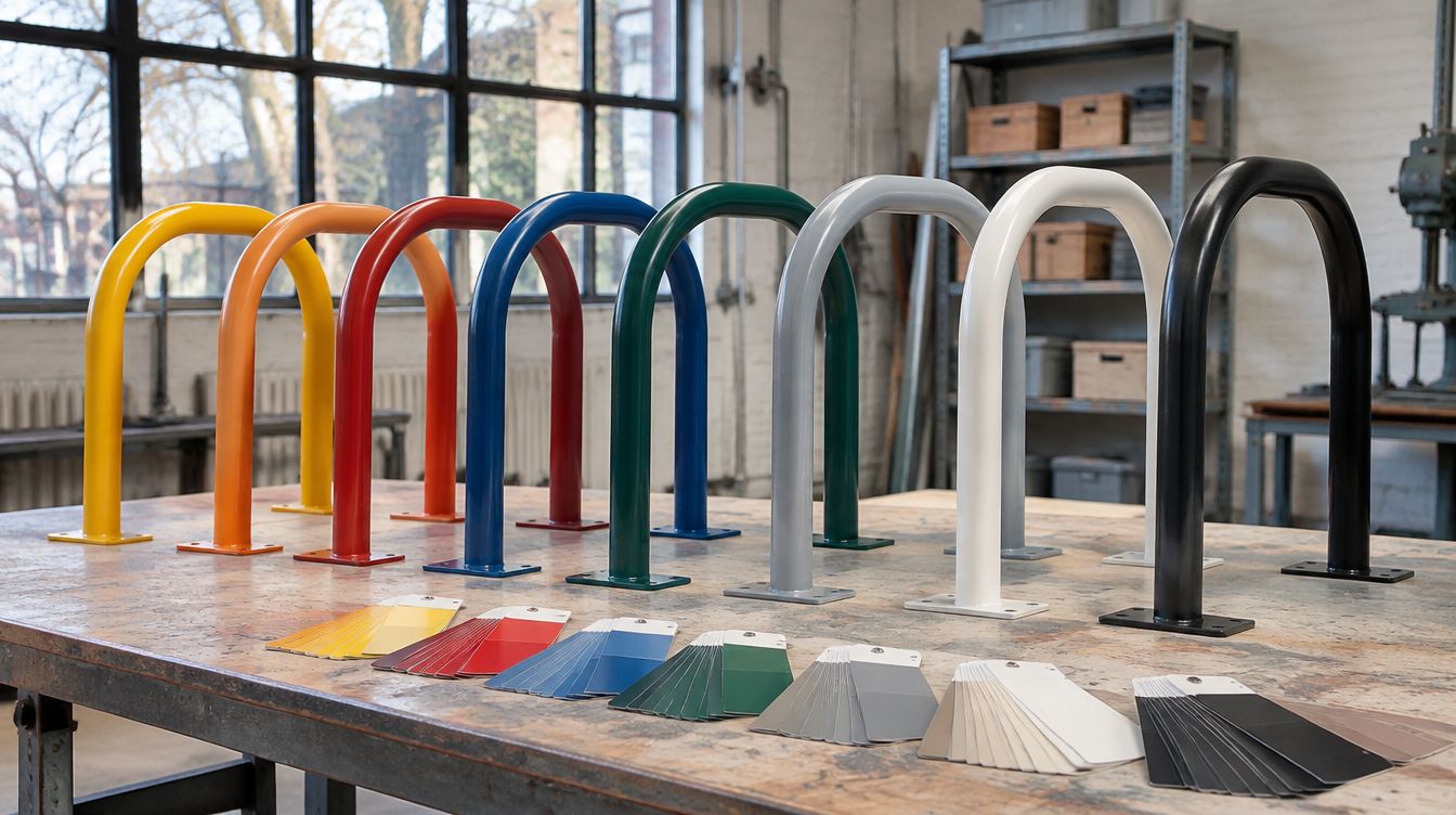
Picking a colour for benches, racks and bins often happens late, in a quick meeting with a fan deck. Yet colour affects much more than looks. It changes how hot a seat gets in July, how quickly dirt and wear show, how visible a bollard is at dusk and whether a recycling station makes sense to the people using it.
This guide covers the practical side of colour choice for powder-coated site furniture, so the finish you approve looks good on day one and still works years later.
Speak the same colour language: RAL
Most powder coaters in North America and Europe work with the RAL Classic system, which gives each colour a four-digit code. Using RAL codes in drawings and specifications removes guesswork. "Dark green" can mean dozens of shades; RAL 6005 means one.
A few RAL colours are widely used for site furniture:
- RAL 9005 Jet black and RAL 9011 Graphite black for classic streetscapes and heritage districts.
- RAL 7016 Anthracite grey and RAL 7021 Black grey for modern, neutral settings.
- RAL 6005 Moss green and RAL 6009 Fir green for parks and natural areas.
- RAL 8017 Chocolate brown where furniture should blend with wood or masonry.
- RAL 9006 White aluminium for a metallic, silver look.
RAL codes identify a colour, not a finish. Always specify gloss level and texture alongside the code, since the same colour looks noticeably different in smooth gloss and fine texture.
Heat: dark seats in full sun
Dark surfaces absorb more sunlight and get hotter. On a sunny summer day, a black steel seat can become hot enough to be uncomfortable or even to burn bare skin, particularly for young children. Light colours stay noticeably cooler.
- For benches, tables and play-adjacent seating in full sun, consider mid-tone or lighter colours.
- If the design calls for black or dark colours, pair the seating with shade, or use a wood or recycled plastic seat on a dark frame.
- Bike racks and bollards are touched only briefly, so heat matters less there.
Our Timber Slat Bench is one way to keep a dark frame while giving people a cooler surface to sit on.
Fading and colour stability
All coatings change slowly in sunlight. How much depends on the powder and the pigments.
- Bright reds, oranges and yellows often use pigments that are more prone to fading. They can look noticeably duller after a few years in strong sun unless a super-durable powder is used.
- Blacks, dark greys, browns and earth tones tend to hold their appearance well.
- Dark colours show chalking, a whitish surface bloom from weathering, more than light ones.
If a bright brand colour is essential, specify a super-durable polyester powder and accept that touch-ups after several years may not match perfectly. Our powder coating guide covers powder grades in more detail.
Dirt, wear and graffiti
| Colour family | Hides well | Shows easily |
|---|---|---|
| Black and very dark | Grime, soot | Dust, pollen, chalking, scratches through to lighter primer |
| Mid greys, browns, greens | Most dirt and light wear | Very little; a practical default |
| White and very light | Dust, heat | Grime, rust staining, tire and shoe marks, graffiti |
| Bright colours | Nothing in particular | Fading and mismatched touch-ups |
Fine textured finishes help any colour hide scuffs from locks and shoes. For high-graffiti areas, a mid-tone in a common RAL code makes it easier to paint over tags with stock touch-up paint.
Visibility and accessibility
Colour is a safety and accessibility tool, not just a style choice. People with low vision rely on contrast between an object and its background to find and avoid it.
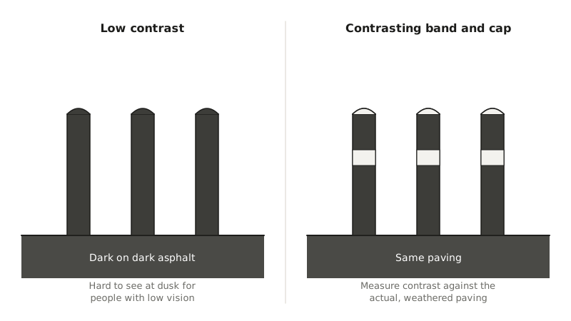
- Bollards, posts and planters in walkways should contrast with the paving around them. A dark bollard on dark asphalt can be hard to see at dusk. Contrasting bands or caps help.
- Benches and seat edges are easier to find when they contrast with the ground and the wall behind them.
- CSA B651 addresses luminance contrast for elements in the built environment, and some provincial and municipal standards add their own requirements. Check what applies to your project.
Measure contrast against the actual paving, which may be lighter or darker than the drawings suggest once it weathers.
Waste and recycling colours
Colour coding helps people sort waste correctly, but only if it matches what they already know. Blue is widely associated with recycling in North America, and green is often used for organics, but programs differ between municipalities. Match receptacle colours or colour-coded lids and panels to your local collection program, and always pair colour with clear signs and icons, since colour alone fails for colour-blind users.
A multi-stream unit such as the Stream 3 Recycling station can use one body colour with coloured openings or labels for each stream, which keeps a consistent look across the site.
Brand colours and consistency
- Find the nearest RAL. Brand colours defined in screen or print systems often have no exact RAL equal. Ask your coater for the closest standard colour, or for a custom match if the budget and quantity allow.
- Approve a physical sample. Screens and printed fan decks are not reliable. Look at a coated steel sample outdoors, in daylight, beside the paving and buildings it will live with.
- Standardize. Pick a small palette for the whole site or city and use it everywhere. It simplifies ordering, spare parts and touch-up paint, and makes the furniture read as a family.
- Record everything. Keep the RAL code, gloss, texture and powder product name on file so future orders match.
Frequently asked questions
Can you match any colour?
Powder can be made in almost any colour, and our custom builds are available in any shade. Custom-matched powders can add cost and lead time, and small batches may be harder to match exactly on reorder, so a standard RAL is usually the safer choice for large programs.
What is the most practical colour for outdoor furniture?
Mid to dark neutrals such as charcoal grey, dark green and dark bronze-brown in a fine texture are hard to beat. They hide dirt and wear, hold their colour and do not get as hot as pure black.
Should all furniture on a site be the same colour?
Usually yes for the main family, which gives a calm, unified look. Use a contrasting accent colour sparingly, such as for safety bollards or recycling streams, so it still stands out.